What Does a 15-Story Building Look Like During an Earthquake?
The researchers at Caltech can answer that question with remarkable precision. Using physics-based simulations, Professor Monica Kohler’s team models the expected behavior of real high-rise buildings under scenario earthquakes, including a Magnitude 7.8 event similar to the 2023 Kahramanmaraş earthquake in Turkey. They can tell you exactly how much each floor will drift, which beam-column connections are likely to yield, and which corners of a building will see the worst stress. The problem is that none of their existing software could show it in a way that was actually useful.
That’s the gap this project fills. I was selected for this project through a competitive process. The team includes students from MIT, Harvard, CMU, and Caltech all aiming to build a visualization tools that turns raw data output into an interactive analysis. The goal is maximum insight extraction from data.
The Data Problem: 8GB in a Browser
The simulation data for a single building under a single earthquake is around 8GB of displacement, velocity, and acceleration values for every structural node, sampled at every timestep, in three axes plus rotation. My first approach was simple: load the CSV files directly in the browser and parse them client-side. That worked fine when I was only visualizing a small subset of corner nodes. The moment I scaled up to the full structural model, it fell apart completely.
The solution was designing a custom binary format from scratch. The core idea was to compress the data into a format that the browser could reconstruct incrementally, and, importantly, to allow the data to be split into multiple files so the application only loads what it actually needs for the current view.
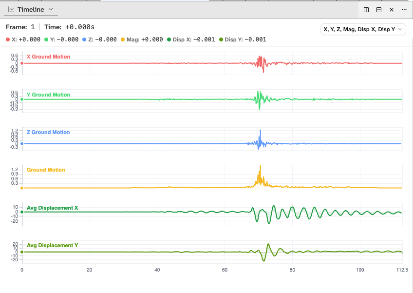
The design principle that made this work is a consistent ordering guarantee: the node array index is the same across every data file. If you access index 412 in the displacement data, the velocity data, and the acceleration data, you always get the values for the same node. The same holds for frame indices across all time series. This means any panel in the UI, whether it’s the 3D view, a floor displacement chart, or a per-node time history, can request only the files it needs and assemble a coherent picture without ever loading the full dataset.
Picking which metrics to include and how to organize them into files was actually the hardest design decision. The simulation produces displacement (X, Y, Z + rotations), velocity, acceleration, interstory drift per corner, peak values, hinge rotation data, and more. Getting the file split strategy right so that the most common views are fast to load while rarer analyses don’t penalize the common case required a lot of iteration with the research team to understand how they actually use the data.
The 3D Viewer
The visualization is built in Three.js 1 via React Three Fiber 2 , and the building can be viewed in several modes depending on what the researcher needs to see.
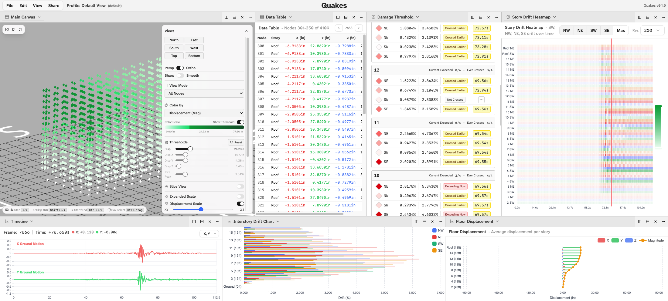
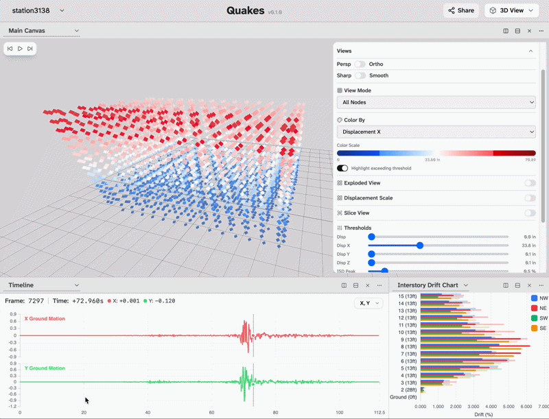
In node view, every structural node is rendered as a point in 3D space, colored by whichever metric the user selects: displacement magnitude, velocity, interstory drift ratio, and more. A threshold control lets users flag any node that exceeds a defined value: set the interstory drift threshold to 2% and every node that crosses it during the simulation lights up, immediately identifying the floors and corners under the most stress. This is the kind of spatial pattern detection that previously required manually scanning tables of numbers.
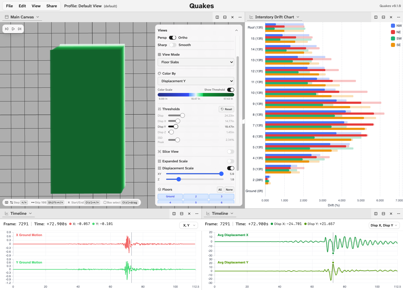
The floor slab view renders the building as horizontal plates, making it easier to see torsion twisting of individual floors from a top-down camera angle. The connections view uses the hinge data to render the structural elements between nodes, showing beam-column behavior and which connections are approaching yield.
All of this is synchronized to a shared timeline. A ground motion waveform runs along the bottom of the screen displaying the actual seismic input from the earthquake station and scrubbing through it animates the entire building in real time. Every panel in the UI, whether it’s the 3D view or a floor displacement chart or an interstory drift histogram, responds to the same playback position simultaneously.
The Panel System
The analysis environment uses a Dockview 3 -based panel system, meaning every chart and view is a floating panel that can be dragged, docked, resized, and arranged however the researcher wants. The default layout gives you the 3D view alongside a floor displacement chart, an interstory drift heatmap, and a timeline, but every layout can be saved and shared via a link so a researcher can configure exactly the view they need, share it with a colleague, and have them open to the same panels, camera position, and timeline state.
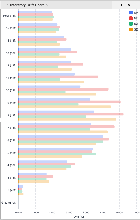
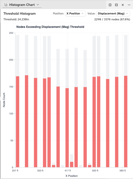
The panels the tool tracks include interstory drift per floor, floor displacement over time, velocity time series, story drift heatmaps, peak value displays, histogram distributions, per-node data tables, and a statistics summary. For an engineer reviewing a new simulation, the typical workflow is to open the max drift profile first which shows a vertical bar chart of peak drift per floor to spot the outlier floor, click its bar to jump the 3D view and timeline to exactly that floor at its worst moment, and then scrub through the loop to watch the columns move under stress.
Design as Part of the Job
The team is currently two people: a designer from CMU handling visual design, and me handling all the computer science. But the line between those roles has never been strict on my side. I’ve done a significant amount of the UI prototyping, interface sketching, and usability thinking that ended up in the implementation. Working through how a researcher would navigate from a high-level overview to a specific failing node, what controls should be persistent versus tucked away, and how to make a scientifically rigorous tool that doesn’t feel like scientific software from 2005.
The project description from the Caltech team put it well: existing earthquake analysis software uses “schematic-like visualizations” that only make sense to people who already understand the domain. The goal here is a tool that a structural engineer, a building code researcher, a city planner, and a non-technical stakeholder can all get something meaningful from, whether that’s a detailed interstory drift analysis or simply watching a building visibly lean and recover during a simulated major earthquake.
Why It Matters
The buildings in this study are real structures. The earthquakes being simulated, including scenarios based on known fault systems, are designed to be rare and physically plausible events. The research team’s findings about which floors drift the most, which connections yield, and which buildings perform better after retrofitting directly informs building code recommendations and retrofit prioritization decisions.
Better visualization doesn’t change the physics calculations. But it changes who can understand the results and act on them. That’s the actual goal of this project and it’s why getting the data pipeline, the 3D rendering, and the analytical panels right all matter equally.
Key Contributions
- Designed a custom binary data format with consistent node and frame ordering, enabling selective loading of 8GB simulation datasets in the browser without performance degradation
- Built the Three.js 3D building viewer with multiple view modes (node, floor slab, connections), metric-based color mapping, and threshold flagging for structural failure identification
- Implemented a synchronized panel system using Dockview and Zustand, ensuring all charts, views, and controls respond to a shared timeline and selection state
- Contributed significantly to UI/UX prototyping and interface design alongside the technical implementation